ABC Learning Design at Aston
July 20, 2018 at 1:43 pm | Posted in educational, hands-on | Leave a comment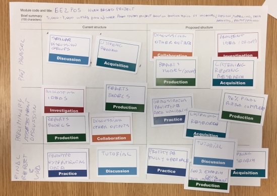
Back in March, I attended a JISC workshop run by Clive Young and Nataša Perović from UCL, which introduced me to their ABC Learning Design activity. This is a development of Ulster’s Viewpoints activity that I was planning to use at Southampton before ILIaD hit the rocks of organisational change. I came away from the workshop determined to try it out in my new role and discussed using it with my academic colleagues in Languages and Social Sciences.
However, later that month I was invited to teach part of our PGCert for new academics, specifically module 3, Becoming a Research-Led Innovator in Higher Education. I was given free rein to redesign it within the limits of the learning outcomes, and quickly decided that Diana Laurillard’s Conversational Framework and the related ABC Learning Design activity would form both the theoretical and practical heart of day 2 of the module.
One challenge I faced was scale; I had three cohorts of around 30 students each and so had to repeat the full-day session on Monday, Wednesday and Friday. I wanted them to use ABC to create a storyboard for one of their own modules, discuss that with two other students and then talk about how they could modify their storyboard to introduce some form of educational innovation. There simply wasn’t going to be room for 30 sheets of flip-chart paper on the tables, so I created a scaled-down version of the resources based on an A3 design grid and business-card-sized activities.
After several hours wrestling with temperamental printers and a rotary guillotine I had around 1200 activity cards – I thought that each participant’s module might need 10 or more activities. Next time, I’ll have them professionally printed as business cards!
The ABC activity was well-timed; it took place after the students had returned from lunch and it was really hot weather, so if I’d given a presentation I think they would all have gently snoozed. As it was, my own observations and feedback from the students confirmed that ABC is a truly excellent ‘thinking tool’ that structured some very lively and productive conversations about the learning design of their modules. In addition to working in their own groups, some of them found real value in visiting other groups and simply observing their conversations.
The ABC resources from UCL are open-source and provided under a Creative Commons CC BY-NC-SA licence, so here are my modified versions for you to download, use and adapt using the same licence. They are all PowerPoint files, so are easy to edit and print as required:
ABC_read_me_first – ABC_module_grid – ABC_activity_shape – ABC_activity_descriptors – ABC_card_set
Share this:

Six months later…
July 18, 2018 at 12:50 pm | Posted in waffle | Leave a commentIt is exactly six months since I wrote my first (and only) post since I moved to Aston, so an update is long overdue. I’m settling into my role here and starting to work on some larger projects:
- Using Aston Replay (Panopto) to record student presentations. The current method is based on rather aged video cameras and involves a lot of manual work to copy and transcode the recordings. There is also the problem of where to archive those recordings so external examiners can view them if required. The new method will use webcams to record directly to Panopto, and I have purchased 8 sets of Logitech C920 cameras, tripods and 5m USB extension cables to facilitate this.
- Using TEAMMATES to enable peer feedback in group projects. I was very impressed by the speed and efficiency of Aston’s legal services in reviewing and approving this system for use, given the new GDPR requirements. I’ll be working with a couple of academics in the Aston Business School on pilot projects.
- Supporting the use of video in Languages and Social Sciences. I have cleared out the small storeroom that forms part of my office and turned it into a video podcast studio. It will provide a quiet ready-to-use space for academic staff who wish to create videos, and I’ll provide the technical support and training they may need.
- Promoting the use of student response systems. The new School of Medicine will be using the excellent TopHat system and are providing their students with iPads so they can take full advantage of that. I’ve been using Meetoo with my PGCert module ‘Becoming a Research Led Innovator in Higher Education’. This has around 100 new academic staff, many of whom have now expressed an interest in using Meetoo.
- Making use of the ABC Learning Design method. I’ve made this one of the core activities of my PGCert module, so again 100 academics have now experienced first-hand what an effective ‘thinking tool’ this storyboarding technique provides. One of my CLIPP colleagues is also piloting this with the Business School.
I had some great news last week when I learned that my colleague Dr Denise Baden from Southampton had been awarded the ESRC Celebrating Impact Prize 2018 for Outstanding Impact in Business and Enterprise. My contribution to this was the virtual hair salon online training (much discussed in this blog last year) which has now been used by around 1000 trainee hairdressers, and featured in the video created for the award ceremony. It was a fantastic project to be involved with, and many congratulations to Denise!
Finally, it looks likely that I’ll be moving house to Worcester in August, completing a process that began just over a year ago, the same week I celebrated 30 years at Southampton University, when I saw the advert for my new post here at Aston. Cheers!
Share this:

Room at the top
January 18, 2018 at 3:43 pm | Posted in waffle | Leave a commentIt is now nearly the end of my second week at Aston University, where I am now the Teaching Fellow for Technology Enhanced Learning in the School of Languages and Social Sciences (LSS). I am also part of the institutional Centre for Learning Innovation and Professional Practice (CLIPP) which in many ways is similar to how ILIaD was at Southampton. So I’m part of a central unit but based in a school (faculty).
My office is on the top 10th floor of the North wing of the main building, with panoramic views to the West of Birmingham. This was originally the College of Advanced Technology, opened by the Queen in 1955 and at the time was the second-largest brick building in the world, after Battersea Power Station. I found this architect’s impression in the lobby:

The North and South wings were added in the early 1960’s and have little to recommend them; they make finding your way around difficult and the floors don’t line up, so you can walk down a corridor from the 9th floor of the North wing to the 7th floor of the main building. I’m spending more time in lifts that I have ever done before…
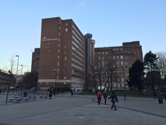
This shows the South wing’s subtle addition to the original design, as well as the Blue and red SkyLifts. There is also a Paternoster (up-and-over) lift, sadly no longer in operation.
The students are busy taking exams and the academics marking them, so during this liminal time I’m easing into my tasks and responsibilities here and learning how the systems work and who are the key people to make contact with.
I’ll finish with that view:

Share this:

Epilogue
December 19, 2017 at 8:27 pm | Posted in waffle | Leave a commentThe final day. After 30 years and 5 months I’ve reached the end of my time at Southampton and my attention turns towards Aston. And yes, it does feel very odd, but today has been a good final day.
It started with a couple of ServiceLine tickets about iSurvey; the first wanted to know if people could save their responses and return later to complete a survey. The answer was ‘yes’, but the online help wasn’t helpful so I corrected that. The other wanted to know if a survey could politely direct people who didn’t match specific requirements to the exit, and I politely pointed them to the relevant help page. I then helped my colleague Julie Reeves configure her new WordPress site that aims to help support Researcher Development and we talked about ways and means of attracting readers to her work. I love this combination of hands-on geekiness, just-in-time user training and consideration of the wider issues. Then it was on to a meeting with my long-time colleague and TEL pioneer, John Woollard from the Education School. We were meeting some of his PhD students for an informal chat about learning technologies, reflecting on the drivers and barriers to effective use of TEL in the classroom, especially in developing nations.
After lunch there was a Yule-log party with my friends Matt, Sam and Graham (amongst others) in the iSolutions ‘Managed learning Environment’ team. We’ve been two sides of the TEL-support coin since the turn of the century, and are a good example of the blurred lines between ‘learning technologist’ and ‘learning technologist‘. There was plenty of cake and a good deal of talk about learning to drive and cars we have known. Finally, I worked on an update to the Sustainable Hairdressing resource that I developed for Denis Baden as part of an ESRC project. There were a few minor edits, but the key activity was to automate the process by which learners gain their Sustainable Stylist certificate. The project funding has nearly run out, so they will no longer be gathering data via iSurvey and emailing certificates manually. I used a link from the final screen to a Google Form to gather the name and email address of people who completed the training, and then Form Publisher to use those details with a Google Slides template to generate a personalised PDF certificate which is automatically emailed to the learner. Magic!
Share this:
So Long and Thanks for all the fish!
December 15, 2017 at 3:31 pm | Posted in waffle | Leave a comment
Back in July I wrote a post ‘30‘ which marked my thirtieth anniversary working at the University of Southampton. At the end of that week I applied for a job as a Teaching Fellow in Technology Enabled Learning at Aston University in Birmingham, and I’m pleased and excited to say that I was successful! So after three decades I’m leaving Southampton to make a fresh start in the Midlands…
I thought I ought to give a farewell lecture, looking back at all the units and projects I’ve worked for, and the colleagues I’ve worked with. I’m an inveterate hoarder, so I also had quite a few objects from those far-off days – from the first user guide I created in 1987 (for the Wordwise word processor on the BBC-B) to the ultra-thin 1.4kg Sony Vaio N505 laptop I bought for a project in 1999 (nearly a decade before the 1.36kg Macbook Air).
After some thought (inconveniently in the middle of the night) I came up with the perfect theme – ALIBABA or A Life in Buzzwords and Bad Acronyms – which pretty much sums up my career. Looking back through my file archives it is amazing how many buzzwords and acronyms I have worked with, so my talk goes from DTP to BYOD, via HTML and a couple of dozen others.
If you have 35 minutes to spare, I made a recording of the talk for posterity. My next post will be in the New Year, from my new job. Merry Yule and best wishes for the coming year.
So Long and Thanks for all the Fish – image by Mathiole – which you can get as a T-Shirt. Cool!
Share this:

Green Gown awards
November 20, 2017 at 1:21 pm | Posted in educational | Leave a comment
Many congratulations to Simon Kemp, who just won a Green Gown award in recognition of his excellent work supporting sustainability. I was really pleased to see in the video that he is still using the UN Sustainable Development Summit game that we developed in 2012; this uses cards and simple rules to facilitate negotiation between teams of students representing global power blocs to get their preferred goals. We tweaked the rules in 2013 to reward and encourage co-operation between the less powerful blocs (e.g. Africa and India) and counter-balance the influence of the major players (US, China and Europe). The result is a really enjoyable and engaging educational game that teaches students about negotiation, the need for compromise and the difficulty of choosing which UN sustainable development goals to focus on.
Share this:

Ian Cognito: an infamous academic
July 13, 2017 at 3:08 pm | Posted in MOOC, waffle | Leave a commentA piece of work I did a few months ago has finally made it to the small screen, as FutureLearn’s English as a Medium of Instruction for Academics enters its second week. I was asked to record a truly awful lecture to illustrate a whole gamut of behaviours that tutors should avoid. I’m involved in local amateur dramatics, and this sounded like a fun bit of theatre to devise. It had to be a fairly short lecture, and I chose a resource (old – so uses Flash) I had already made about copyright as the basis.
I thought about how I would bring in the various elements of bad practice, but the whole thing was recorded in one take without any rehearsal. You may note that I nearly corpse a couple of times, but manage to keep going. I was especially pleased with the cultural references to English children’s literature from the 1950s that would bamboozle any international students unfortunate enough to be in the audience.
So without any further introduction, here is Ian Cognito showing how not to do it…
I’d just like to point out that Ian Cognito is my evil twin and in no way reflects my actual teaching style. Just as Anna Nymyti is my ‘fake Polish student’ alter-ego I use for testing software systems… and I’ve just learned of a French cousin called Sue Denìmê…
Share this:
Ally: a game changer for accessibility
July 12, 2017 at 10:55 am | Posted in educational, systems | Leave a commentTags: accessibility, Blackboard
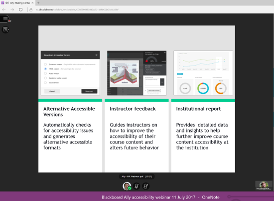
Yesterday I attended a Blackboard webinar about their new system, Ally, and immediately saw that this would be a ‘must-have’ for any institution that is serious about improving the accessibility of their online resources. Ongoing changes to the Disabled Student Allowance have made institutions legally responsible for providing reasonable adjustments for students with learning differences and disabilities, and Ally offers three ways to meet that duty.
Automatic creation of accessible versions of resources
Ally integrates with Blackboard’s normal workflow, so tutors upload their files using the same process as they currently use (which now includes drag-and-drop) and the primary link is to that file (e.g. a Word, PowerPoint or PDF document). A new dropdown menu offers links to accessible versions; HTML, ePub, electronic Braille or audio file. These versions are only generated by Ally the first time a student requests it, and are stored by Ally so do not take up additional storage space on our Blackboard servers. Ally uses Amazon Web Services for processing and storage, and offers institutionally-controlled cloud storage if required.
I was really impressed with the quality of the conversion from original file to HTML. Ally uses sophisticated semantic structural analysis and machine learning to recognise headings, lists and tables and even deals with multi-column layouts, maths and equations. The HTML version is used as the basis for the other accessible formats.
So Ally provides students with accessible versions of documents without any additional effort or input from tutors. That in itself is a major win, but wait – there’s more…
Nudging tutors to improve the accessibility of their resources
When the tutor views the resource item in Blackboard, they see a small coloured ‘gauge icon’ alongside the link. Green indicates good accessibility, orange is so-so and red means it needs improvements. Clicking the icon brings up detailed feedback on what the problems are and what the impact on students is – for example if images embedded in the document do not have ALT text, then students with visual disabilities cannot access them at all. Ally also offers context-sensitive advice about the practical steps needed to resolve the issue (e.g. how to add ALT text in Word). Tutors can upload a revised version of the document and immediately see its improved rating.
Institutional oversight of accessibility data
The final aspect of Ally is designed to help institutions meet their legal duty by providing the data that enables accessibility to be measured and improvements to be tracked over time. It lists the most common issues, and identifies those modules that need significant work. The administrators can drill down to individual modules and resources, so care will need to be taken to ensure that tutors get appropriate support and advice and that this is not seen as a performance management tool.
It’s easy to see how these three aspects of Ally work together to enable institutions to make a step-change in the accessibility of their learning resources – and that’s why I think Ally is a game-changer. How can an institution NOT offer this facility?
As a final note, I was really impressed that Ally already works with Blackboard, Moodle Rooms and Canvas Instructure, and will soon be available for stand-alone Moodle and even D2L’s Brightspace (Blackboard’s main rival). That’s the right move – accessibility for all!
Share this:

30
July 7, 2017 at 5:08 pm | Posted in waffle | Leave a comment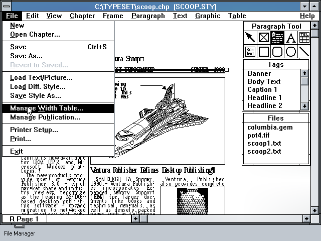
This week, it has been 30 years since I joined the University as the Desktop Publishing specialist in Computing Services. Back in 1987, a massive IBM 3090 mainframe provided most of the University’s computing power, supplemented by BBC B Micros and a wide variety of other early micro-computers. I was one of the lucky few to have an IBM XT 286 with a 6MHz 80286 processor, 640kB of RAM, a 20MB hard drive and a 13″ colour screen with VGA graphics showing 16 colours from a 256-colour palette at a resolution of 640×480 pixels. I used it with Ventura Publisher and the only HP LaserJet on campus to create user guides, posters and newsletters. This was pre-Windows; Ventura had its own graphical user interface (GUI) that used a mouse.
Today, I’m still lucky enough to have a state-of-the-art device; I’m typing this on a Microsoft Surface Pro 4 with a 2.2GHz Core i7 processor, 16GB of RAM, a 256GB SSD and a 12″ screen showing 16 million colours at a resolution of 2736×1824 pixels. OK, the screen is a bit smaller, but it is fully touch-enabled with pen input… and I have a lovely 27″ display plugged in to it. Today I’ve mainly been using it to author an interactive guide using Articulate Storyline.
And of course it has this thing called ‘The Internet’ that was still in its infancy when I started… Do I feel old? Not really, just experienced.
Share this:

decentralised – delightful – digital
May 18, 2017 at 2:11 pm | Posted in event | Leave a commentTags: #procterphd, design
Yesterday I went to see my colleague Adam Procter give a talk about his ongoing PhD research in Web Science. Adam is Programme Leader for Games Design and Art at our Winchester School of Art and always has interesting things to say about the intersections of learning, technology, design and culture. You can view the slides on his website.
He started with a provocative question “Why are the digital tools used by tutors so terrible, and why can’t anyone fix this?”. He graphically showed this by contrasting the 2-minute 20-click process required to upload and announce a PDF using Blackboard and the 10-second drag-and-drop equivalent using Slack. This wasn’t an entirely fair comparison as Blackboard stored the PDF in structured folders, while in Slack the PDF was an item in a linear timeline – and the latter approach makes it hard to find resources later, especially if keyword search is poor. For example if the PDF is called Lecture 5 Design Theories a search may find dozens of messages with one or more of those keywords. But the tutor could spend a further 10 seconds to drag-and-drop the PDF to a DropBox folder, thus enabling learners to also access and browse structured resources.
The first section of his talk focused on arguments for decentralised systems to support learning. A key concern is the way in which the dominant, centralised web companies (Google, Facebook and Twitter) track our interactions to commoditise our data and individualise (and constrain) our experience. This can be a good thing, but as we discovered during the Brexit campaign, it also led to “information bubbles” and the viral spread of fake news. In the education world, learning analytics privilege things that can be easily measured, which are not necessarily the things that really matter.
I make the case that digital technologies are being imposed upon formal learning environments, particularly focused within HE and often associated with the ‘student experience’ agenda. This imposition often reflects what amounts to a thoughtless approach to teaching and learning, in which pedagogy is side-lined by neo-liberal practices of efficiency and surveillance.
Alan Bainbridge (2014) Journal of Learning Development in Higher Education
You can join the discussion about decentralised services on Adam’s research website.
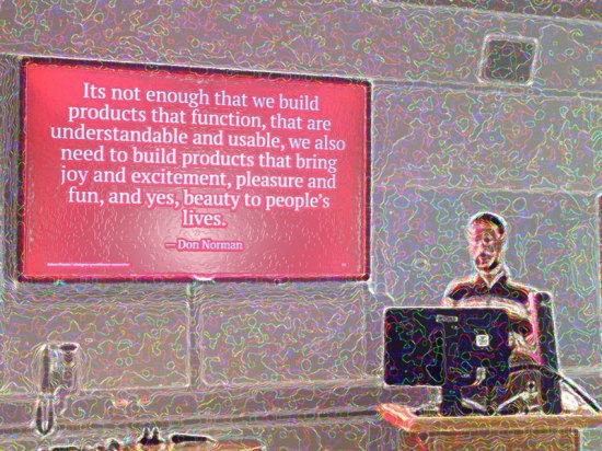
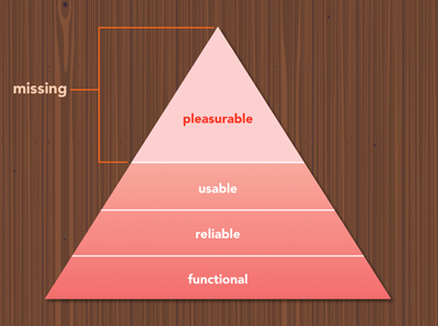
The second section explored delightful design, and after a brief ghost-train ride through the everyday horrors of some of our institutional systems moved swiftly on to some examples of playful and elegant UI and UX (user interface and user experience). I particularly liked this diagram showing Aaron Walter’s hierarchy of user needs.
 < I feel I ought to confess that writing this blog post is definitely a displacement activity to put off the awful moment when I need to continue developing our new Digital Learning website using SitePublisher, perhaps the most user-hostile system I’ve ever had the misfortune to encounter. >
I think that most of the delightful examples he showed are a result of three convergent factors; apps that need to do just one thing (excellently), hardware that easily supports animated interfaces, and authoring tools that simplify the creation of those interfaces. There is also a greater focus on designing UI and UX that guide users through process flows, such as booking an airline ticket. For example, I recently came across a great blog post by Issara Willenskomer on the 12 principles of UX in motion to improve usability.
In the final section, Adam introduced an early prototype for a digital tool to support learning. This involved linked nodes of information and reminded me conceptually of some of the visual tools I have played with over the years – in particular The Brain and the excellent (and free) CmapTools. My current go-to visual organisation tool is MindMeister, which enables sharable mind-maps. I thought his prototype focused too much on content creation and lacked support for social learning, but hey, it’s early days yet.
I also think that familiar tools and systems are more likely to be adopted than bespoke solutions – so at the moment I’m looking at the new Office 365 and thinking what a great learning environment it would make, with its seamless integration of file storage, communication and collaboration… plus some really neat content creation tools such as OneNote and Sway. Some features (Teams, Planner) are ‘very similar’ to popular tools but that’s a good thing (unless you are Slack or Trello). It’s also a million miles away from being a decentralised service, but Microsoft really seem to be paying attention to the user experience – maybe not delightful, but pretty good and getting better all the time. So to finish with another provocative question “Which IT company do you think is bringing the most exciting innovations to market at the moment, and would you trust them with your data?”
Share this:

-

Creative Commons Licence

TELic: a blog about Technology Enhanced Learning by Adam Warren is licensed under a Creative Commons Attribution-NonCommercial-ShareAlike 3.0 Unported License.
Create a free website or blog at WordPress.com.
Entries and comments feeds.

You must be logged in to post a comment.