Storyline video with embedded quiz questions
May 11, 2017 at 10:07 am | Posted in hands-on | Leave a commentThe Articulate Community was, as usual, immensely useful when I wanted to learn how to embed quiz questions in a video, and this post builds on advice and examples from David Anderson and Montse Anderson. In particular, I liked Montse’s use of Storyline’s Lightbox feature to show normal question slides on top of the paused video… but the template she provides does not include this feature, so I needed to figure it out for myself and ended up with an elegant hybrid of their two approaches. Try this for yourself by clicking the screengrab – and/or download the Storyline 2 .story file.

Step-by-step process
- Start by creating a slide for your video and a set of question slides.
- Add a hotspot over the video, right-click on it and deselect Show Hand Cursor on Hover. This prevents learners from clicking on the video to pause it.
- Press spacebar to play the video and tap the c key to add cue points when you want your questions to appear. The cue points show on the timeline and be dragged to fine-tune their timing.
- Add a new layer to your video slide for the first question. I called this layer Q1marker.
- Add a graphic marker to this layer – I used a circle with a ? You can set the size, colour, font, transparency and location as required. You should change its duration from the default 5s to whatever is required – so mine are on screen from 0s to 4s on the layer’s timeline. I also used animation to fade the object in and out (0.2s each); this looks much smoother than a sudden appearance and disappearance. Finally, I added a Hover state to the marker – I just changed the fill colour and font colour.
- On the video’s base layer, add a Slide Trigger that shows layer Q1marker when the timeline reaches Cue point #1. Add similar triggers for the other question layers.
Now when the video plays, the marker will appear on top of the video for its set duration when the timeline reaches its cue point. The video does not pause, and learners do not have to click it – so short durations could test observation and speed of reaction. Markers could even be (nearly) transparent so avoid giving a visual clue to a critical event in the video e.g. a mistake in a medical procedure.
- Add another layer which will pause the video and display the question. I called mine Q1lightbox. This layer has no objects; just a Layer Trigger to Lightbox slide ‘question 1’ when the timeline starts.
- Click the Properties gear icon next to the layer’s name and select Pause timeline of base layer and Hide slide layer when the timeline finishes. The first pauses the video while the second un-pauses the video after the lightbox slide closes.
- I adjusted the duration of this layer’s timeline to 1.5s. This means that the video will resume playing 1.5s after the learner completes the question, giving them just enough time to re-focus on the video.
- Now add a trigger to the marker on layer Q1marker to show layer Q1lightbox when the user clicks.
So now if the learner clicks on the marker, this layer is shown, the video pauses and the first question slide is lightboxed (i.e. displayed on top of the current slide). The final step is to adjust the question slides to work using this lightbox approach.
- Add a trigger Close lightbox when the user clicks to the Continue button on both the Correct and Incorrect layers.
- Delete any Next and Previous buttons – these questions are ‘stand alone’ and are only seen if the learner clicks the marker while it is visible.
Now when the learner reads their feedback from question 1 and clicks the Continue button, the lightbox closes, the layer Q1lighbox plays out its 1.5s timeline before automatically closing, and the video resumes playing.
The good news is that after testing that this all works as expected you can now copy-and-paste the elements to quickly create further questions:
- Video base layer: copy the Slide trigger and edit the layer shown and cue point used.
- Q1marker layer: copy and edit the layer’s name, the location of the marker and the layer shown when the marker is clicked.
- Q1lightbox layer: copy and edit the layer’s name and which question slide is lightboxed.
- Question slide: copy and edit the question. responses and feedback.
This example will no work on iPhone or iPad at the moment, but after some investigation I eventually found this was a problem caused by the Edshare repository I used to store the output files.
Click video to start it playing?
In the course of this frustrating series of tests I tried an extra step required if you want the video to click when played:
- Set the video option to Play video when clicked
- Create a graphic saying ‘Click video to start’
- Add a Slide Trigger to Pause timeline on this slide when the timeline starts
- Add a trigger to the video:
Resume timeline on this slide when the user clicks
(optional: Change state of “Click video to start” to Hidden when the user clicks) - Move the hotspot so it starts at about 0.25s on the timeline
You need to pause the slide timeline and restart it with the video, or they get out of step, and start the hotspot after 0.25s so you can click on the video to start it!
Share this:

Articulation 6: playful learning
April 4, 2017 at 3:57 pm | Posted in projects | Leave a commentTags: playful learning, Storyline
I was keenly aware that this training on sustainable hairdressing was voluntary, and this provided several design imperatives:
- It should be fairly quick to complete; I was aiming for around 40 minutes and our data showed that was actually the average time taken.
- That placed constraints on the amount of content, especially text – and I also thought that ‘bite sized’ ideas would best suit our target audience.
- It should be engaging and fun, with plenty of interactivity: exploring the virtual salon, liking ideas to increase your EcoPro score and answering quiz questions. I also included a few playful items, described below.
- I really wanted learners to say that it was “interesting and quite fun” rather than “dull and boring” in any word-of-mouth (and social media) recommendations.
Quiz questions
Learners were presented with a single quiz question as they left each area to return to the virtual salon. These were not scored and were used as an opportunity to emphasise a key learning point. Storyline makes it easy to show layers providing a hint if the first attempt is incorrect and the correct answer if the second attempt is incorrect.


Graphic carbon savings calculator
Denise wanted learners to understand the scale of savings that could be made by some simple changes in hair-washing behaviour; for example do you really need to shampoo twice? I created a slide with six options that showed the carbon savings graphically by using a footprint shape whose area matched the ‘carbon footprint’ of various choices:


Again, a link to the calculations was provided for anyone who wished to view them.
Good try!
The start of the training includes guidance on how to Like ideas, see your EcoPro score and collect the Big Ideas, where it says “Click this icon if you see it on any page.” I thought some learners might try clicking the example icons and wanted to ensure that their initiative was acknowledged. Why ducklings? Because I thought any training that made you smile was off to a good start!


Easter Egg
It was about a year ago, just before Easter, when I visited Shine to take the panoramic photo used for the virtual salon. As a ‘thank you’ to the staff I bought them a chocolate egg, but first placed it on a shelf so it was included in the photo. Many apps include an ‘Easter egg’, a playful feature or message hidden by its programmers, and I thought it would be fun to use the real egg to access one of the ten areas in the salon. I wanted to reward the learners with a cute photo, and after debating the relative merits of kittens and puppies decided to use both! This area concluded with a research question whose feedback made the point that most customers do want salons to consider environmental issues. Remember that this training aimed to motivate hairdressers to change their behaviour by providing them with carefully selected information.
Try it yourself!
We are no longer collecting data, and the training is now hosted on the University’s Edshare repository and can be accessed by anyone. Why not give it a try? Most learners took around 35-40 minutes to complete the training.

Click the image to access the training.
Share this:

Articulation 5: what’s the score?
April 4, 2017 at 10:49 am | Posted in projects | Leave a commentTags: Storyline
If you’ve been following these posts from the start, you may remember that “The aim was to inform (hairdressers) about environmental issues and encourage them to adopt sustainable business practices that used less energy and water and created less waste.”
In the second post I described how learners could ‘like’ ideas they encountered and to see the savings that the idea could achieve:
My idea was to translate the costs and savings for each topic into a standard format that would give the energy, water and money savings each year if adopted by a small four-seat salon. As learners worked their way through the training, a running total could therefore be kept of the savings from all the ideas where they clicked the Like button, so they could easily see the amount saved and scale that up for their own salon if required. I suspected that although the energy and water savings would be seen as a good thing, it would be the substantial money savings that would really gain their attention.
This example shows how this process works in practice. Suppose a learner has just started exploring the virtual salon and finds the Hair Drying area:
These slides show some of my core design decisions:
- using a photo of the researcher, Denise Baden, as the human face
- to introduce each area of the training.
- using photos and short texts for each idea that minimise the risk of tl;dr, which is always an issue with online training.
- using fresh, bright colours – especially the ‘green for Go’ Like button;
- only showing the savings when the learners have clicked the Like button, so I hoped they would be curious. Of course the more ideas they liked, the more impressive their total savings on the EcoPro slide, reinforcing the idea that lots of small savings add up to a very significant impact.
- I didn’t think many learners would want to see the calculations, but we needed to include them to show we hadn’t just plucked the figures out of thin air.
- although the environmental savings are energy (kWh) and water (000’s of litres), I needed to translate those into specific financial savings. Hair salons are businesses, so any investments in energy-saving technologies need to see a good return.
- some benefits, such as reductions in water pollution or giving good advice to customers, are difficult to express financially, so I used a ‘Good Deeds’ measure to identify and reward these.
The EcoPro slide used four variables; ENERGY, WATER, ENVIRONMENT and MONEY. These were updated when a learner clicked the Like button for the first time; I didn’t want multiple clicks to artificially inflate the EcoPro totals. So for example the Lighting slide’s Like button had four triggers, two of which were conditional on the Like button’s state:
Add 3645.00 to ENERGY
  When the user clicks
  If LikeButton's state is not equal to Visited

Add 510.00 to MONEY
  When the user clicks
  If LikeButton's state is not equal to Visited

Change state of LikeButton to Visited
  When the user clicks

Show layer Savings
  When the user clicks
It was easy to show the value of the variables on the EcoPro slide; all that was needed was to include the variable name in the text e.g. %ENERGY%.
During its first six months the resource was hosted on SCORM Cloud and data was collected from around 600 learners. This was analysed by Denise’s research project to identify which ideas were liked the most.
Hunting the Big Ideas
Part of the brief was to introduce learners to five sustainability concepts, which I called the Big Ideas; Climate Change, Carbon Footprint, One Planet Living, Sustainability and Water Scarcity. I decided to make this a treasure hunt; learners needed to collect (view) them all by finding five icons scattered throughout the areas and ideas. When they had visited seven areas they could view a list of direct links to all areas and Big Ideas – see Avoiding frustration in a previous post.


In the final post about this project, I’ll cover the playful aspects I included to try and make this training something that the learners would enjoy and recommend to colleagues.
Next: Articulation 6: playful learning
Share this:

Articulation 4: trigger happy
April 3, 2017 at 9:27 am | Posted in projects | Leave a commentTags: Storyline
In my previous post about the Sustainable Hairdressing project, I talked about the 40 triggers used to ensure that the salon panorama slide showed which areas had been already visited. But there were still a few more to add to provide a smoother user experience.
Providing guidance to the learners
The first was a trigger that showed a layer with instructions the first time a user visited the salon panorama – i.e. if the variable how2pan is True. I initially included an OK button to hide the instructions layer and set the variable to False, but feedback from test users made me simplify that by replacing it with a transparent rectangle covering the whole slide. This meant that the layer was hidden and the variable set to False wherever the user clicked – for example if they try to drag the slider while the instructions were visible. The same technique was used on a few other slides to display ‘just in time’ guidance the first time they were visited. Note the ? button at the lower left of the screen that re-displays this slide’s help if needed.

Users can click anywhere on this slide to hide the instructions
Avoiding frustration towards the end of the training
We didn’t want our learners to become frustrated when hunting for the last few areas, so I used the locs variable, which counts the numbers of areas visited, to make two changes when it reached 7.
- The first was to change the state of a button called locHints from its initial Hidden state to Normal. Hidden buttons cannot be clicked and do not change the mouse cursor when rolled-over. When clicked, the button displays a slide with direct links to all areas, using button states to clearly indicate those that have already been visited.
- The second was to display a layer with instructions, telling users they could click the locHints button to “see a list of location short-cuts”. An OK button is used to hide this layer.

Direct links to the three areas that still need to be viewed.
It’s probably worth emphasising how much this project relied on three core Storyline features:
- Button States – where I changed the text colour and icon to show areas that had already been visited.
- Variables – keeping track of which area and ideas had been visited, as well as some running totals such as energy savings.
- Triggers – and especially conditional triggers that only took effect if one or more conditions were met, such as visiting an area for the first time.
Rewarding learners when they complete
Finally, when learners have visited all of the locations and the locs variable equals 10, a layer is displayed congratulating them and providing guidance on finishing the learning.
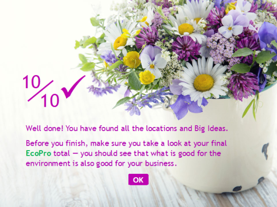
Learners see this when they have completed the training.
This splash screen is an example of how I tried to make the training more playful and motivational, from the ‘gift’ of fresh flowers to the language (10/10 and the big tick) and the key take-home message that “what is good for the environment is also good for your business”.
In the next post I’ll look at the other ways in which I used playful elements and gamification to try and make this training a fun and engaging experience for our learners.
Next: Articulation 5: what’s the score?
Share this:

Managing student responses
March 3, 2017 at 12:17 pm | Posted in educational, student response systems | Leave a commentWe are piloting the Meetoo web-based student response system which supports in-class messaging as well as polling. Students can send messages which are immediately visible to the whole cohort, and click to ‘like’ messages they agree with. It is also possible for the tutor to moderate messages, but let’s leave that feature aside for now.
I’d like to share and reflect on the experiences of James Wilson, a colleague in our Faculty of Health Sciences, who used Meetoo for the first time this week in a session about mental health issues for around 80 students. His feedback to me included:
During the session I personally found it a challenge to multi-task – it meant juggling my oral engagement with the audience while monitoring the message board. During the session the message board exploded with comments and I simply could not keep track.
At the start of the session he invited the students to share their thoughts and questions throughout, and these mainly appeared as three ‘bursts’ of 10-15 messages around specific themes. Most of the messages were comments on the content of the session and none required an answer from the tutor, so there was no need for James to ‘keep track’. A total of 81 students answered polling questions using Meetoo, so it seems only a minority were sending (and reading?) messages.
Some typical comments:
Medication can solve a large portion as many cases can be along the route of chemical imbalance in the brain.
Mental illness often involves a combination of medical and therapeutic interventions like CBT, counselling therapies etc.
Giving a tablet to someone does not get to the root cause of the problem!!!!! We should be helping not medicating straight away
Suggested good practice
Tutors could ask for comments at a few relevant points during a session, and just review messages as they come in. Some students will send comments, while others will simply use the ‘like’ feature. Directing students to the message feature like this should lead to a higher proportion of students engaging with it. The Meetoo FAQs indicate that it will soon be possible to sort messages by the number of likes, which would be helpful.
In a recent webinar, Meetoo said that they would soon offer an open-text question type, but those are best suited to one or two-word answers, so I still think messages are the best way for students to share comments. The tutor can mark selected messages as ‘favorites’ and I understand that it will soon be possible to share just these messages with the students via a Projector tab. This would enable the tutor to gather feedback from the whole class and then re-focus their attention on a few of the key points raised. I think there is also an opportunity here for the tutor to ask students to spend a few minutes discussing those key points in small groups.
Perhaps if students have a question they would like the tutor to answer, they could prefix their message with a Q – for example “Q why do you think mental health issues are increasingly affecting teenagers?” The tutor could quickly review the messages towards the end of the session and either answer these at that point, later online or in the next session.
Social messages
Students sent social messages at the very start of the session, but these stopped as soon as the session got underway. There were no inappropriate messages; just jokey ones. I think this is a good example of students exploring how the system works and then getting focused.
I spy beginning with w
window?
To the walls…
Yay window
*leaves conversation
Finally, one student posted a very positive comment at the end of the session about the use of Meetoo which got ten likes:
Awesome app. Should be used for all our lectures! Encourages more discussion for us shy ones ??
This initial feedback indicates that Meetoo offer an easy-to-use and effective medium for in-class comments that encourages discussion, and that further experience will help us develop and strengthen its impact on learning.
Share this:

Bringing interactive storybooks to life in the classroom
December 12, 2016 at 10:11 am | Posted in student response systems | Leave a commentTags: Meetoo
I was invited by the Meetoo team to write a guest article for their blog, providing a bit more context to my recent post about the use of Meetoo in-class polling to enable students to control progress through a branching storyline. Read it here, including some confessions about my teenage years (roll 3D6 to make your saving throw against Spotty Nerds with Specs!)
Update: I found a video from Poll Everywhere in which a medic, Jeff Solheim, uses student voting on a trauma-injury scenario to show them how their choices affect the patient.
Share this:
Articulation 3: the virtual salon
December 7, 2016 at 6:06 pm | Posted in hands-on, projects, Uncategorized | Leave a commentTags: Storyline
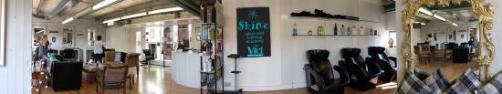
The central idea of this resource was the virtual salon, based on a panoramic photo I took of the Shine salon:
Using sliders to pan the photo
As previously mentioned, I found an article by Glenn Simsek on the Articulate user forums that showed how to create a scrollable panorama based on two Storyline sliders.
- Slider 1 has the panoramic photo as the slider button ‘fill texture’
- Slider 2 is visible to the learner and is used to pan the photo
I scaled the photo so it was the correct height to fit my design for the 960px x 720px (px = pixel) slide; so the height is 342px and width is 2048px. In fact I resized all images to minimise the bandwidth required by the resource.
Storyline objects are layered, and I added a copy of the background image with a transparent window (600 x 342 px). This acts as a frame that overlays the photo so that only a 600px width slice of the photo is visible at any one time.
The blue bar behind the photo in this image is the Storyline slider 1. I needed to calculate the width of the slider so that it matched the width of the photo. If the photo is panned hard left, then the hidden part is (2048-600)=1448px wide. Ditto if panned hard right. The total width of slider must allow for 1448px on each side of the 600px width central window; so width = 1448 + 600 + 1448 = 3496px.
This was set on the Slider Design tab, along with parameters to centre the photo when the learners arrive in the virtual salon. I also set the slider to move in 100 discrete steps; this looks visually smooth and enabled me to easily use the value of variable Slider 1 for triggers that control the visibility of other layers on this slide.
Variable=Slider1, Start=0, End=100, Initial=50, Step=1
Slider 2 is a regular slider whose Variable is also set to Slider1 – so moving this slider also moves the other one with the photo. Of course moving this slider left also moves the photo left, which looks like you are panning right, so I fixed this by reversing the Start and End values for Slider 2:
Variable=Slider1, Start=100, End=0, Initial=50, Step=1
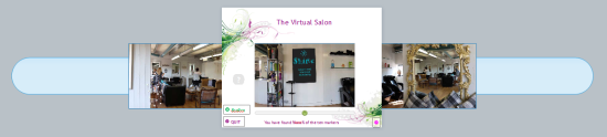
Areas of Interest markers on the panorama
I wanted the learners to search the virtual salon for areas of interest, but didn’t want to use mouse-over as that technique does not work on mobile devices. Instead, I chose to have markers appear when the photo was panned to a specific value. I added triggers to Slider1 which showed a layer with the marker if the value of Slider1 was between two values, and hid it if it wasn’t. For example:
Show layer loc1
   when the slider moves
   if Slider1 is Greater than or equal to 94
   AND Slider 1 is Less than or equal to 96
Hide layer loc1
   when the slider moves
   if Slider1 is Less than 94
   OR Slider 1 is Greater than 96
Using a range of valid values (94, 95 and 96 in the example above) made it easier for learners to pan the slider and spot the markers; a single value (e.g. 95) was too difficult.
Returning to the virtual salon
The value of variable Slider1 is stored, so the virtual salon photo is automatically panned to the same point as it was when the learner last saw it when they return to the slide.
I wanted areas which learners had already visited to be visually indicated, so I created versions of the marker for each of these states:
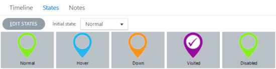
The variable loc1 is set to TRUE when learners view the area of interest and is used by a Slide trigger to change the appearance (state) of the Button_loc1 on layer loc1:
Change state of Button_loc1 to
   Visited
   when the timeline starts
   IF loc1 is equal to TRUE
I also added triggers to the frame image to make sure the correct layer was visible when learners return to this slide (i.e. when the timeline starts as the slide is redisplayed):
Show layer loc1
   when the timeline starts
   IF Slider1 is Greater than or equal to 94
   AND Less than or equal to 96
   AND loc1 is equal to TRUE
You can see that with 10 locations to find, this slide already had 40 triggers – and there were another 10 or more to add… but I’ll talk about some of those in the next article.
Next: Articulation 4: trigger happy
Share this:

Articulation 2: PPPPPP
November 16, 2016 at 4:16 pm | Posted in Uncategorized | Leave a commentTags: Storyline
With approval to go ahead with development, the next step was to start preparations in detail. All of these activities proceeded in parallel:
- Creating the content– writing the text and finding the images for each topic
- Calculating the data – the energy, water and money savings for each topic.
- Liaising with businesses – suppliers of hairdressing products and a local salon.
- Coding prototypes – learning exercises using Storyline to test my ideas.
- Documentation – a necessary evil.
Creating content
The challenge was to write just two or three sentences about each topic that conveyed its environmental impact and sold its benefits in ordinary, non-technical language. For example, for low-flow aerator taps:
Aerators introduce bubbles into the water and help it feel soft. They also reduce the amount of water used — and save energy as you need less hot water.
They are inexpensive, simple to fit and the payback period is typically just a couple of weeks.
It may be an obvious point, but getting the script right is essential; if it isn’t then no amount of flashy multimedia interaction will compensate for that.
Photos from Shutterstock were chosen to accompany each topic, and a careful record was kept to ensure it was easy and quick to cite them correctly when the credits slide was created much later in the project.
Data calculations
Other researchers on the project had already obtained information about environmental benefits; for example “Low-flow aerators can save money. Fitting a tap aerator at a cost of £5/tap could result in water savings of £13/tap/year (*based on tap being used 20 times a day for 15 seconds Source: Envirowise info sheet, 2007)”.
Tap aerator – image © Shutterstock.com/infausto
My idea was to translate the costs and savings for each topic into a standard format that would give the energy, water and money savings each year if adopted by a small four-seat salon. As learners worked their way through the training, a running total could therefore be kept of the savings from all the ideas where they clicked the Like button, so they could easily see the amount saved and scale that up for their own salon if required. I suspected that although the energy and water savings would be seen as a good thing, it would be the substantial money savings that would really gain their attention.
I developed a fairly complex Excel spreadsheet for the calculations; luckily my engineering background meant I wasn’t phased by having to use the specific heat of water to calculate the number of Megajoules used to heat 1000 litres by 20 degrees and then convert that to kWh so that the annual cost savings from a low-flow aerator tap could be calculated. A maths-free version of my calculations is included in the training, hidden behind a ‘How we calculated this’ link. I didn’t think that many learners would chose to view these, but thought that it was important that we were able to justify the savings we claimed; for example:
Assume standard tap flow rate is 5 litres per minute and aerator tap flow rate is 3 litres per minute.
Assume standard tap is used for 20 minutes each day, for a total of 30,000 litres each year.
The aerator tap saves 12,000 litres a year = £60
It also avoids heating that water, saving 420 kWh and £59.
The total saving is £119
Liaison with businesses
We wanted to include images of a few specific products, such as the Gamma Piu energy-saving hairdryer, and Enki one-use towels. I emailed their distributors and made sure we had written permission to use the images they provided.
We also worked with Shine, our on-campus hair salon, who kindly agreed to allow us to use their salon as the basis for the ‘virtual salon’ photo at the heart of the training. We also used it as a location for the introductory video with Dr. Denise Baden. I made sure that we got all the location and personal release forms required, including some from clients who appeared in the photos.
Coding prototypes
I built several rough prototypes to learn about variables and to verify that my ideas were achievable. There were also two key features I needed to develop:
SCORM data: As mentioned in the first article, this work was funded by a research project which wanted to identify topics ‘liked’ by the learners. For example, with modern shampoos there is no need for two applications, and shampooing once saves time, water, energy and money – as well as reducing water pollution. Were the learners persuaded by these arguments?
It was agreed that the training resource would be hosted on SCORM Cloud, which would enable data tracking. I built a prototype to learn about how the system worked and interacted with a resource created using Storyline and published using its SCORM output options.
Scrolling panoramas: I wanted to create a ‘virtual salon’ for learners to explore and find areas of interest. I used my camera to take a 180-degree photo of the salon, and then talked to colleagues and searched the excellent Articulate user forums for advice. I found an article by Glenn Simsek that was exactly what I was looking for, and spent some time experimenting with that to get it right. It may even be the subject of the next article in this series!
Documentation
Painful experience has taught me the value of documenting projects as you go:
- an accurate timesheet to help me more accurately cost future projects;
- a record/store of meetings, emails, decisions, sign-offs and so on;
- a record of all resources used and their source;
- notes about the coding developed, which makes it easier to understand what you did and why when you return to it months later to make changes.
This account makes it seem like I prepared everything in advance, but of course the reality was messier; the script was amended as the project developed, a few new topics were added, most of the data calculation happened during the development phase, and almost all the images were chosen and edited as the relevant topic was created.
In the next article I’ll start discussing the nitty-gritty as the resource begins to be developed.
Next: Articulation 3: the virtual salon
Share this:

Articulation 1: from idea to storyboard
November 14, 2016 at 4:21 pm | Posted in hands-on, projects | Leave a commentTags: Storyline
This is the first in a short series of articles that describe the journey from client request to finished product for an interactive online educational resource created using Articulate Storyline. This was my first real project using Storyline, and my aim is to document and reflect on that process in the hope that other novice designers will find it useful.
In November last year I was contacted by Dr Denise Baden from our Business School and asked if ILIaD could develop some online training for hairdressers. The aim was to inform them about environmental issues and encourage them to adopt sustainable business practices that used less energy and water and created less waste. This would be part of a wider ESRC-funded project, so gathering data about their use of the training was a requirement.
My first step was to scope the project so I could develop a proposal and give a first estimate of the likely cost. I looked at the PowerPoint slides they used for their half-day face-to-face training sessions and structured the content as a mind map using MindMeister:

My initial proposal was to have a photo of a real salon with activity areas, such as a client having their hair washed, that would highlight when the learner pointed at them. Clicking would show a close-up of the activity and some questions/options. Selecting these would increase or decrease the learner’s ‘Eco Score’ and show feedback about their choices.
Denise liked this idea, but wanted to a) stress the importance of the sustainable advice hairdressers provided to their clients and b) ensure that all of the feedback related to the impact of their choices on the key topics: energy, water and pollution. There were also five ‘big ideas’ to communicate – for example ‘One Planet Living’.
I refined my proposal in the following email, which I’ve included in full as it encapsulates some key design ideas:
You’re quite right – I thought that the impacts would be linked to from multiple points – so for example with the low-flow aerator tap the info could have a ‘Why should I care?’ button that would lead to a page about water scarcity – and that page could also be reached from (e.g.) the washing machine info etc. Alternatively we might need a set of icons for savings (money/water/energy-carbon/pollution/waste) so that it is easy to apply several to one item (e.g. low-flow aerator saves money, energy and water)
It may be that these big themes could be introduced at the start – a photo of the outside of the salon with image buttons that lead to brief info about the five impact themes. These probably should be videos – for the target audience I suspect that TL;DR is an important factor (if you’ve not come across that acronym before, please google it! ) – and the user has to view these (and maybe even take a fun quiz) before they can enter the salon.
In my view the overall key design objective is to create a resource that will educate, inform and entertain so as to persuade these hairdressers that going green is the best, sensible and professional thing to do that will deliver benefits for them, their salon, their customers and the planet. We should use positive words like ‘savings’ and avoid bombarding them with stats/figures/graphs where possible – I suspect that most of them find ‘maths’ both scary and incomprehensible. At the end of the course what three things do we want/expect them to remember? My ideal would be:
1. know that salon activities have an impact on the environment
2. know that their choices can reduce that impact, save money and benefit customers
3. think that they can and should make the right choices
But I wouldn’t expect them to remember anything about gigatonnes of carbon, temperature rise curves and so on – except to know that the climate is changing, the human and environmental impacts are very serious and that their actions really do count – especially if they also persuade their customers to do the right thing as well.
This set some important project parameters; the objective was to educate and motivate the learners, to provide a positive message about savings, and to minimise the amount of text.
I then created a rough mock-up in PowerPoint that showed how the interactivity might work; this helped my thinking as well as enabling me to more easily discuss it with Denise. Together with the mind-map, it formed my storyboard for the project – as shown in this video:
The final part of this phase was the project documentation, which provided a high-level description of what ILIaD would create, the milestones and their dates, and my best guess at the time required and the total cost. Given this was my first Storyline project, would that guess be sufficiently accurate? Only time would tell…
Denise approved the storyline, project documentation and budget and so I moved into the production phase.
Next: Articulation 2: PPPPPP
Share this:

A user guide for Common Learning Spaces
November 10, 2016 at 5:12 pm | Posted in educational, systems, useful links | Leave a commentTags: CLS

I represent ILIaD on the Common Learning Spaces Working Group, and provide input on issues relating to technology in those rooms. It is interesting to consider how much technology there is in a modern lecture theatre; the lectern PC, data projector, visualiser, DVD player, microphones, connections for Ethernet, audio, VGA and HDMI video – and of course the touch-screen panel used to control all these devices.
We’ve been putting some thought into how we can help tutors get to grips with all of these; it seems that there is no training provided for new tutors and when I looked for documentation it was hard to find and out of date – no mention of HDMI for example. Over the summer I used WordPress to create a new website that aims to provide ‘just in time’ advice; it is accessed via the simple shortcut: go.soton.ac.uk/cls
Laminated A4 posters will be displayed by the lectern that give that link as well as the ServiceLine contact number for urgent problems. The posters have space so that simple issues such as “no black whiteboard marker” can be written down and fixed by the team of room checkers at the end of each day.
The CLSWG regularly reviews a list of the problems encountered by tutors in CLS rooms, and a troubleshooting section on the website aims to help tutors quickly fix simple problems themselves. Of course if the PC isn’t working they won’t be able to access the online advice, but then they need to phone ServiceLine anyhow!
Its important for ‘experts’ such as myself to remember that learning technology includes the common hardware that tutors use every day as well as the online systems we are more usually concerned with.
Share this:

-

Creative Commons Licence

TELic: a blog about Technology Enhanced Learning by Adam Warren is licensed under a Creative Commons Attribution-NonCommercial-ShareAlike 3.0 Unported License.
Blog at WordPress.com.
Entries and comments feeds.

You must be logged in to post a comment.